
menomorphosis
Empowering women during their menopause journey with a sense of fun and optimism

My Role:
UX Research, UX/UI design
Timeline:
4 months, 20-30 hours per week
Date:
August 2024
Tools:
Figma / FigJam, Adobe Illustrator & Photoshop, Firefly, ChatGPT, Optimal Workshop, Lookback
Background
Menomorphosis is a site that offers positive and hopeful support for women navigating the challenges of menopause. It educates about menopause, provides step-by-step solutions and resources for managing symptoms, offers encouragement from other women through a community portal, as well as stories from postmenopausal women who prove that the best years are still ahead.
The Problem
Women in the menopausal transition feel discouraged.
Women entering perimenopause, or in the throes of menopause, are often overwhelmed and discouraged from the sudden changes in their bodies - both physically and mentally. Making matters worse, the vast amount of information regarding menopause is often contradictory, making it difficult for women to discern whether or not the information is valid or snake oil. Unfortunately, there are limited options online and most that exist are confusing and hard to navigate, making it difficult to know where to start.
Project Goals
The project goal was to create a user-friendly site that women love to visit, containing reliable resources on menopause and tips for managing symptoms in a positive and encouraging environment. The aim: a site that helps women to feel optimistic and hopeful about what's happening to their bodies during a traditionally scary and difficult time, thereby allowing them to take charge of their health and well-being.
How might we get women who either haven't started menopause, or are in perimenopause or menopause, to realize that even though this stage of life isn't easy, this is actually a positive transition with new beginnings and wonders ahead?
The Design Process


-
Research Plan
-
Competitive Analysis
-
User Interviews
-
Affinity Map
-
Research Insights
-
Personas
-
POVs & HMWs
-
Card Sorting
-
Sitemap
-
User Flows
-
Task Flows
-
Lo-fi wireframes
-
mid-fi wireframes

-
Branding
-
Hi-fi wireframes
-
Prototype

-
Usability Testing
-
Priority Revisions

Empathize
Research I Competitive Analysis I User Interviews I Affinity Map I Research Insights
Overview:
Before I could create a solution, I first needed to understand the specific problem I was going to solve. Research was the key to discovery. The research process helped me to define my users’ goals so I could design a site that provided the solution.
I enjoyed the research process as much as the design, because I’m able to use both my analytical and creative skills. I also enjoy working with people and learning ways to help them achieve their goals.
Tools: FigJam, Zoom
Research Goals
I wanted to discover the pain points women experience during menopause so I could provide solutions that educate and help them navigate menopause in a healthier manner.
Objectives
-
Determine pain points
-
Understand needs and requirements
-
Understand preferred methods of learning something new
-
Learn what features should be included
Competitive Analysis
To gain insights on how I should approach designing the site, I chose to research competitors’ sites. As a result, I discovered a way I could stand out from the competition.
My research revealed only one clear competitor. Their site was the easiest to navigate, is content and feature rich, and all resources are scientifically verifiable. However, it is packed full of content, making it difficult to know where to begin. Also, the site content reads like a textbook - serious and heavy feeling.

User Interviews
I interviewed six women from a variety of backgrounds and ages in varying stages of menopause.
-
Cis-born women
-
35 - 55 years old
-
Variety of backgrounds
-
Premenopausal, perimenopausal, or menopausal
User Goals and Motivations
-
Understand menopause and it's impact
-
Understand the benefits of the changes
-
Mitigate or eliminate symptoms
-
Maintain physical health and overall well-being
-
Incorporate healthier food into diet
User Pain Points
-
Loss of hormones that are having an impact on their health and well-being
-
Learning and adding new tasks into an already busy schedule
-
Lack of information and reliable resources
-
Discerning fact from snake oil
Affinity Map
I created an affinity map using three stages to narrow down what was a vast amount of information I gathered conducting interviews. This helped me identify key themes and patterns which revealed women's pain points, needs and requirements, and desirable features that will help them achieve their personal goals.

Key Research Insights
Women, regardless of which stage in menopause...
-
Are looking for hope and encouragement
-
Want to understand why their bodies are doing what they do
-
Want solutions to help them cope and/or manage their symptoms
-
Want trustworthy resources with no biases or agendas
-
Prefer research and information that comes from female doctors and researchers
-
Want a supportive community of women with similar experience
From the interviews it was clear that women are discouraged about menopause and worried about the impact it has on their health and quality of life.

Define
Personas I POVs & HMWs
Overview:
Creating user personas, POVs and HMWs was beneficial in helping me narrow down the users’ goals, motivations, needs, and pain points. Getting specific about the users before ideating helped me stay focused throughout the design process on the people that matter – premenopausal, perimenopausal, and menopausal women.
Tools: Figma, Firefly
Personas

This is Itiko
Itiko represents women who are struggling with menopausal symptoms and are concerned about the overall impact these changes are having on their long-term health and well-being.
POVs & HMWs
POVs Statement #1: Focus on Health Benefits
I'd like to explore ways to encourage all women who are either premenopausal, perimenopausal, or menopausal, to make lifestyle changes that will benefit them in the long run because their health and well-being are important.
HMW Question #1
How might we encourage all women who premenopausal, perimenopausal, or menopausal, to make lifestyle changes that will benefit them in the long run because their health and well-being are important?
POVs Statement #2: Focus on Positive Impact
I'd like to explore ways to help women want to use the menopause site to learn and explore all the ins-and-outs of menopause because I want them to realize that, though it's not an easy ride, this transition marks new beginnings and wonders ahead.
HMW Question #2
How might we get women who are either premenopausal, perimenopausal, or menopausal, to realize that even though this stage of life isn't easy, this is a positive transition with the new beginnings and wonders ahead?

Ideate
Card Sorting & Sitemap I User Flows & Task Flows I Low & Mid-fidelity Wireframes
Overview:
Discovering what problems users are having and then defining the problem to solve, it was time to start creating the solution. Before jumping into the designs, I ran a Card Sort exercise and created a Sitemap, User Flow, and Task flows. These were critical in helping me ideate the visual solution – a site for menopause, because the next steps were to create low and mid-fidelity wireframes.
Tools: Figma, FigJam, Optimal Workshop,
Card Sorting
Tool: Optimal Workshop
Before creating solutions, I needed to validate the desired content on key screens, understand how users think, and determine how they categorize topics. I used Optimal Workshop to conduct an unmoderated Card Sort using words I generated from the affinity map.
Sitemap
I also needed to consider how I would structure the site in order to make it easy for users to find what they want.
Based on my discovery of what features and topics users desired from the Card Sort, I created a sitemap to help me visualize how the pages should be connected to one another.

User Flows
Next, I needed to create assumptions about how my users would use and navigate the site. I did this by creating User Flows. It was important for me to consider the user's perspective and how they might carry out the required steps to complete a task.
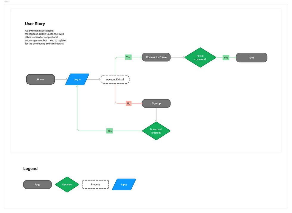
Task Flows
In addition to mapping out how users will move through the site, I needed to dig a little deeper and untangle the business and technical aspects I may have missed from the User Flows.
I created Task Flows to help me visualize the single path users will go through to navigate to their desired destination.

Wireframing
Tools: Pen & Paper / Figma
Creating a sitemap was beneficial to brainstorming ideas for the layout and design of the site. I enjoyed the process of sketching ideas and then building them using Figma.
Low-fidelity Wireframes
I brainstorm best using pen and paper because it allows me the freedom to "mess up" as I come up with ideas. I'm able to generate several ideas quickly before moving into the digital realm.

Mid-fidelity Wireframes
I generated mid-fidelity wireframes in Figma from the low-fi wireframes I sketched out. I improved the designs as I moved through each step in the process (low-fidelity to mid-fidelity to high-fidelity) because new ideas emerged, improving the flow and navigation of the site.


Design
Branding I High-fidelity Wireframes I Prototypes
Overview:
I enjoy the process of creating visuals, whether for clients, target audiences, or in my personal work. I find it satisfying seeing my ideas "come to life" - in this case creating layouts and adding color, images, and content. So I enjoyed reaching this particular part of the UX/UI design process.
Tools: Figma, Adobe Illustrator & Photoshop
Branding
I began with determining the users' values because they helped me select colors, typography and logo concept. Combined they create rich symbolism for feminine wisdom, courage, and transformation.
Logo
I began by quickly sketching some thumbnails and chose the one that best represents the users values. I incorporated the M for Menomorphosis and the image of a butterfly to emphasize transformation.
The butterfly is a powerful metaphor for transformation and change, hope and optimism, beauty and grace, and freedom and lightness.

High-fidelity Wireframes
Using the mid-fidelity wireframes, color palettes, typography, and overall branding, I created high-fidelity wireframes of all the pages. I used Firefly to generate some of the images and ChatGPT to fine-tune copy and make content less wordy and more friendly.

Prototype
To ensure the site would meet the approval of users, I used Figma and created prototypes with the UI screens I designed.
Goals
-
Is the site easy to navigate?
-
Is it easy to find information?
-
Does it contain the information they desire?
-
Do they find the site and content engaging and encouraging?
Note: Prototype includes revisions that were made after usability tests were conducted.


Test
Usability Testing I Priority Revisions
Overview:
I enjoyed the Testing stage because it helped me understand what worked well and where I needed to improve.
This process was the culmination of all my hard work and effort. Did I succeed? Only testing a prototype would provide the answer. And if I didn’t succeed, testing would help me know what needed addressing so that I could revise the design until success was achieved.
Tools: Figma, Lookback, ChatGPT, Firefly
Usability Testing
Tool: Lookback
I used Lookback to run live user tests remotely. This allowed communication to happen immediately between the testers and me. The transcription feature saved considerable time and helped me remember key areas that needed to be revised, as well as comments from users.
-
5 Users
-
Ages 25 - 55
-
Remote Testing w/ Lookback
Assigned Tasks
-
You want to learn about menopause and its symptoms
-
You want to learn how nutrition can help you manage menopause symptoms
-
You're looking for encouragement about life after menopause
Follow Up Questions
-
Was it easy or difficult to figure out where you need to go?
-
Do categories, locations, imagery, and phrasing make sense? Why or why not?
-
Did you find it easy or confusing to navigate? Why?
-
What are your thoughts about the overall design of the site?
-
Based on your experience, would you revisit the site? Why?
Testing Insights
Task 1: Learn about Menopause
Two people were confused between "Menopause Quiz" and "Menopause Academy"
Task 2: Learn the role nutrition plays
There was some confusion about why they landed on the Begin Journey Page instead of the Nutrition.
Recommendations
-
Add more descriptive text to Menopause Academy.
-
Add a description for Granny's Sage Advice to help differentiate between it and Girl's Club.
-
Add carousel on mobile for the Six Steps in Begin Journey and make it clear that they are steps.
-
Come up with a solution for the confusion over landing on Begin Journey Page instead of the page for a specific topic (i.e. Nutrition, Exercise, etc.)
Priority Revisions
I made revisions based on users recommendations. Due to the subtle nature of changes, this required little time and it wasn't necessary to stick to a priority list. I made all the changes that were recommended and the result helped eliminate the initial confusion between which page they were seeking.


User Testing Feeback
Users Overall Thoughts
5/5 Users feel hopeful and empowered!
Overall, users found the site inviting - a place they want to visit because of the happy, positive, and uplifting vibe it creates - in sharp contrast to what is typically a serious, heavy topic. As a result of the upbeat and encouraging atmosphere users are motivated to return to learn more about menopause and what they can do as they navigate this challenging time.
"I love this site! It's so fun and it gives me hope! This topic is usually heavy and depressing, but now I want to return so I can learn more."
Liz (41 & Perimenopausal)
Final Thoughts
Challenges
Time Constraints and Finding Content
The biggest challenge I faced was creating a site about a topic with a long history of neglect and misinformation, and finding trustworthy, reliable and verifiable data. I great deal of my time was spent in the research stage, specifically trying to understand women's needs and desires, learning about menopause, and finding reliable resources.
Imagery
AI helped somewhat, but it was challenging to find images that would help create a sense of cohesion and relate to my audience and the subject.
Key Takeaways
On a project that is content heavy, and requiring significant research to ensure data is trustworthy, something had to be sacrificed in order to make the deadline - in this case, I kept content to a minimum. In real world terms, time would need to be extended if a solo venture, or speed up the process by working with a team of people.
What I'm Most Proud Of
Aesthetics & Overall Design
I'm proud of the ideas I came up for the company name, logo, and for the color scheme that represents my users. I'm also proud that I was able to come up with a site that is easy to navigate and simplifies what is an overwhelming vast amount of information into easily digestible pieces while also making the content feel light verses heavy.
Accomplishing My Goal: Realized it was achieved based on users feedback
To create a user-friendly site about menopause that women want to visit because it helps them feel optimistic and hopeful about what's happening to their bodies as they go through menopause. A site that empowers them to take charge of their health and well-being in spite of what is traditionally thought of as a "scary and difficult" transition.