
Costco Crowd Check
Your Costco Run, Now Crowd-Free
.png)

My Role:
UX Research, UX/UI design
Timeline:
3 Weeks, 30-40 hours per week
Date:
March 2025
Tools:
Figma / FigJam, Adobe Photoshop, Firefly, ChatGPT, Zoom, Export SVGs
Background
I was tasked with adding a new feature to an existing app. I chose to add a Crowd Meter to the Costco app—a simple, user-friendly feature that shows how busy a store is, both in real time and for future hours or days. It’s meant to help people plan smarter and shop more efficiently, whether they’re navigating a tight schedule or just prefer a calmer experience. The concept was shaped by talking to real users, who all shared the same sentiment: knowing what to expect before stepping into the store can make a big difference.
This feature aligns with Costco's commitment to customer satisfaction and efficiency while providing a competitive edge over other retailers.
The Problem
Costco warehouses are known for offering bulk discounts and high-quality products, which often leads to high foot traffic and long checkout lines, especially on weekends and holidays. Many customers struggle with unpredictable crowd levels, making their shopping trips inefficient and sometimes stressful.
Current Solutions & Gaps
-
The Costco app currently does not have a feature that helps members choose the best time to shop based on traffic levels.
-
Some Costco locations post general peak hours online, but this does not provide real-time or predictive insights.
-
Google Maps offers crowd estimates, but it lacks Costco-specific data and predictive analytics.
Project Goals
The goal of this feature is to enhance the shopping experience by reducing wait times, minimizing congestion, and helping members make informed decisions about when to shop. By providing real-time and predictive crowd data, the Costco Crowd Meter will improve efficiency for both shoppers and store operations.
By integrating a Crowd Meter, shoppers can:
-
Avoid peak times and reduce waiting in long lines.
-
Plan trips efficiently using real-time and predictive data.
-
Enjoy a smoother shopping experience with fewer bottlenecks at checkout.

How might we empower people who want control over their shopping experience to choose for themselves when it's the best time to shop so they can get in and get out quickly, making for a stress-free shopping experience?


Empathize
Research I Competitive Analysis I User Interviews I Affinity Map I Research Insights
Overview:
Before designing the site, I needed to understand what customers want and need and research was the key to learning the answers. The research process was valuable in helping me to define customers goals so I could design a site that provided the solution.
I enjoy the research process as much as the design, because I’m able to use both my analytical and creative skills. I enjoy learning ways to simplify systems that help users achieve their goals.
Tools: Pen & Paper / Figma
Research Goals
I wanted to understand customers' needs, concerns, and motivations so I could design a feature that truly solves their problems and feels meaningful to use. I wanted to create a solution that not only addresses common shopping frustrations—like crowded stores and unpredictable wait times—but also feels quick, easy to access, and intuitive. It was important that the design fit naturally into Costco’s existing app experience, making it feel like a seamless extension of what customers already know and trust.
Objectives
-
Determine pain points
-
Understand needs and requirements
-
Learn what features should be included
Competitive Analysis
In researching the competitive landscape, I found that no direct or indirect competitors currently offer a Crowd Meter feature within their apps. To gather inspiration, I looked to the fitness industry, where apps like Planet Fitness use real-time occupancy tools to help members plan their visits. I also considered Google’s Popular Times feature, which provides general crowd data, but relies on third-party location tracking and lacks the accuracy that Costco’s internal data could provide.
This gap in the market highlights a unique opportunity for Costco to lead with a truly useful, store-specific solution.

User Interviews
I interviewed six people from a variety of backgrounds.
-
Various gender identies
-
25 - 55 years old
-
3 Costco Members
-
3 Non-Costco Members
-
1 shops at competitor store
-
2 previously shopped at Costco
-
User Goals and Motivations
-
Time optimization
-
Smooth, hassle-free shopping
-
Control over schedule
-
Comfortable shopping experience
-
Easy decision-making
-
Making dollars stretch further
-
More time to relax
User Pain Points
-
Wasting time
-
No reliable way to check crowd levels
-
Feelings of overwhelm in crowded environments
-
Lack of control over shopping conditions
-
Avoids Costco because too time consuming
Affinity Map
I created an affinity map to better understand customers’ shopping behaviors, the challenges they face at big box warehouse stores, what might prevent them from shopping at these stores, and their motivations for choosing Costco. My goal was to learn whether a Crowd Meter would be a desirable feature—one that could help solve real pain points and seamlessly fit into their daily routines.

Key Research Insights
Customers want...
-
Easy solutions that fit seamlessly into their routines
-
To optimize their time when shopping
-
Flexibility and control over their schedules
-
To reduce feelings of overwhelm when shopping in crowded environments
-
To know real-time and future crowd levels
Interviews confirmed that the Crowd Meter would be a highly valued addition to the Costco App and would be a widely used feature.

Define
Personas I POVs & HMWs
Overview:
Clear patterns emerged from the research, which was used to create personas that represent Costco's customers and people who shop at big box warehouses.
I identified users goals, motivations, core needs, and pain points.
Tools: Figma & Firefly
Personas
This is Melissa
Melissa represents a broader group of shoppers who find crowded environments overwhelming and often avoid warehouse stores like Costco because of the stress that large crowds create. These individuals value a more predictable, calm shopping experience but still have an interest in Costco’s offerings. For people like Melissa, a feature like the Crowd Meter could make all the difference—giving them the ability to plan trips during quieter times and helping Costco feel more accessible and manageable.

This is Kati
Kati represents a key group of potential Costco customers—busy individuals who want to save time and money. People with busy schedules and family responsibilities are drawn to Costco for its high-quality products and potential savings, but hesitate to shop there due to the crowded, time-consuming experience. For this audience, having a way to know when the store is less busy could make a significant difference—turning Costco into a practical and appealing option because it fits more easily into their lives.

POVs & HMWs
POVs Statement #1: Focus on Deciding When to Go
I want to help people with flexible schedules who want control over their shopping schedule because they still value their time, to be able to get in and out quickly without unnecessary delays, making for a stress-free shopping experience.
HMW Question #1
How might we empower people who want control over their shopping schedules to choose for themselves when it’s the best time to shop so they can get in and out quickly, making for a stress-free shopping experience?
POVs Statement #2: Focus on Reducing Overwhelm
I want to help shoppers who are feeling overwhelmed in crowded environments, making it difficult for them to make decisions, have a reliable solution that allows them to plan their trips when crowds are low for a stress-free shopping experience.
HMW Question #2
How might we help overwhelmed shoppers feel more confident choosing Costco by giving them control over when they shop, especially during low-crowd times—making Costco a more appealing option than competitors?
POVs Statement #3: Focus on Saving Time
I want to help people with time-strapped schedules reduce stress and maximize time efficiency by providing them with the ability to strategize shopping trips.
HMW Question #3
How might we help time-strapped people reduce the stress of shopping and maximize their time by providing a means to quickly make informed choices of when is the best time for them to shop?

Ideate
User Flows I Low-Fidelity Wireframes
Overview:
Before diving into the design, I focused on mapping out user flows and creating low-fidelity wireframes to clarify how users would interact with the Crowd Meter feature. These early steps helped me define the most intuitive paths, identify potential friction points, and ensure the experience aligned with user needs. By visualizing the structure first, I was able to move into the design phase with a clear direction and greater confidence in how the feature would function within the app.
Tools: Pen & Paper / FigJam
User Flows
I needed to create assumptions about how my users would use and navigate the site. I did this by creating User Flows. It was important for me to consider the user's perspective and how they might carry out the required steps to complete a task.

Wireframing
Tools: Pen & Paper
I like to start with sketching wireframes. This establishes a clear vision early on, ensuring that users/customers, stake holders, and I are aligned throughout the design process.
This early step allows for quick exploration of ideas and helps me identify potential challenges early on before moving into the detailed design work.
Low-fidelity Wireframes
To begin shaping the Crowd Meter feature, I sketched three different versions of Costco’s homepage, each integrating the new feature in a unique way. I also explored multiple layout options for the detailed Crowd Meter page, considering how to present both real-time and future crowd data clearly. These sketches laid the foundation for reimagining the Costco app from the ground up, helping me visualize how the new pages and flows would fit into the existing structure.
I conducted in-person user tests on the sketches to find out which homepage concept users preferred and to ensure I was covering all necessary details on the feature page. The feedback I received during this phase was incredibly valuable—it helped me hammer out the details on paper before jumping into digital design, giving me clarity and confidence moving forward.


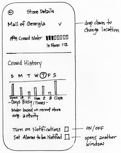
*Due to testers feedback I ended up combing the ideas from the homepage which created a more streamlined and easier to read design. I also eliminated the "set alarm to be notified" feature.

Design
Branding I High-fidelity Wireframes I Prototypes
Overview:
I enjoy the process of creating visuals, whether for target audiences, stakeholders/clients, or in my personal work. I find it rewarding seeing ideas "come to life" - in this case creating layouts and adding color, images, and content. I enjoy reaching this particular part of the UX/UI design process.
Tools: Figma / Export SVGs
Branding & Visual Consistency
To ensure the new feature felt like a natural extension of the Costco app, I first gathered key branding elements—including official fonts, colors, icons, and imagery—to accurately recreate the look and feel of Costco’s digital experience. It was important that everything I designed, from layout to typography, aligned with Costco’s existing visual language. I also put care into choosing a name for the Crowd Meter feature that reflected Costco’s tone and values—straightforward, helpful, and member-focused. Maintaining this level of consistency was critical; the goal was for the feature to feel so seamless that users would recognize it as part of the app they already know—just with something new and useful added in.
High-fidelity Wireframes


Prototype
To ensure the feature would meet the approval of customers, I used Figma and created prototypes with the UI screens I designed.
Goals
-
Is the feature easy to find?
-
Is the feature easy to understand?
-
Is it easy to find future crowd predictions?
-
Does it contain the information they desire?
-
Would they use this feature? How often and for what purposes?
Note: Prototype includes revisions that were made after usability tests were conducted.


Test
Usability Testing I Priority Revisions
Overview:
I enjoyed the Testing stage because it helped me understand what worked well and where I needed to improve.
This process was the culmination of all my hard work and effort. Did I succeed? Only testing a prototype would provide the answer. And if I didn’t succeed, testing would help me know what needed addressing so that I could revise the design until success was achieved.
Usability Testing
Tool: Figma
I used Figma to run in-person user tests. This allowed communication to happen immediately between the testers and me. I used a recording device on my phone to save time and transcribe conversations I could access later.
-
3 Testers
-
Ages 27 - 45
-
In-person using Figma Prototyping
Assigned Tasks
-
Find out if their local Costco currently has low crowds.
-
Check future crowd levels in order to plan the best time to shop in the next few days.
-
Change the warehouse to see crowd levels at a different location
-
Turn on notifications to receive advanced warnings when crowds are at their preferred level.
Follow Up Questions
-
Did the category title, location on the site, and imagery help you know where to go?
-
Did you find the graph for the predicted weekly crowds easy to understand?
-
Does it contain what you expect? Would you add anything?
-
Would you use this feature? How often and for what reasons?
-
What do you think about the overall design?
Testing Insights
Task 1: Check real-time crowd levels
All 3 found it immediately and said it was very easy to read; "Green" means go.
Task 2: Decide best time to shop tomorrow
Once again testers found the link immediately. "Three dots are standard on apps to indicate more."
Recommendations
-
Switch "Days" and "Hours" on the Weekly projections graph so that "Days" are on the bottom.
-
Makes it more obvious that the colored bars indicate the hours instead of the days.
-
Easily change the days with your thumbs because near the bottom of the screen.
-
-
Make the current hour stand out more from the other hours
-
Eliminate the notifications feature:
-
2 found it unnecessary and would not use it
-
One participant expressed concern that the "Notifications" feature could backfire if too many people receive the same alert about low crowd levels—potentially causing a sudden rush and making the store busier than expected. This would negate the entire purpose of the crowd meter.
-
Priority Revisions
Due to limited time and because no critical or confusing situations were revealed during testing, I made two of the three recommendations:
-
Removed the notification feature because it risked negating the purpose of the crowd meter in the first place.
-
Emphasized the current hour on the graph. Both changes only took a few minutes.
There was no need to create a priority list since there were only 3 suggestions.
I think the idea of switching the placement of "Days" and "Hours" is worthy of consideration, but I would like to test the graph in a real-world environment to determine the efficacy of the change. I recommend this option only because the changes to the graph would be minimal, wouldn't require significant code changes, and would therefore take little time to do so.
Based on one tester’s feedback, it think it may be worth revisiting the idea of adding notifications after the app has been in use for a while, once there’s enough data to support more accurate predictive crowd levels.


User Testing Feeback
Users Overall Thoughts
5/6 Users would use this feature every time
Overall, users responded very positively to the Crowd Meter feature. They found it easy to locate within the app and appreciated how simple it was to read and understand the graph. Testers specifically noted that the use of color-coded hourly bars (green, yellow, orange, red) helped them quickly grasp how crowded the store would be at different times, making the experience both visually clear and user-friendly.
In addition to usability, users were genuinely enthusiastic about the value this feature brings. They shared that it would help them save time, plan around their own schedules, and make more intentional decisions about when to shop. For those who feel overwhelmed in crowded environments, having visibility into store traffic gave them a sense of control and relief, knowing they could shop at times that feel more manageable and less stressful.
"My schedule is busy but flexible. And I would use this every time I need to go because it allows me to choose the most optimal time for me."
Mike (Efficient Team Leader)
"I wish this was real, because I would definitely use it. I would start shopping at Costco if I could shop when it's not so crowded."
Melissa (Stressed & Anxious)
Final Thoughts
Challenges
Finding Costco Resources
One of the biggest challenges in this project was tracking down the visual assets needed to create high-fidelity wireframes that accurately reflected Costco’s app and website. Finding the right icons, fonts, colors, and imagery required careful research, as these elements aren’t readily available or documented. However, replicating Costco’s design system as closely as possible was essential to ensure that the new feature felt like a natural, seamless extension of the existing experience. This attention to detail helped me design a solution that blends in visually while standing out in functionality.
Learn Advanced Auto Layout Features in Figma
Another challenge I faced was needing to learn some of Figma’s more advanced auto layout features. I spent several days searching for reliable tutorials, often having to watch multiple videos just to determine if they actually covered what I needed. The process was time-consuming, as much of the content available wasn’t helpful or clearly explained. Thankfully, I had anticipated a learning curve and built in extra time for this phase, which allowed me to stay on schedule while still gaining the skills I needed to complete the design successfully.
Key Takeaways
This project reinforced the importance of designing not just a feature, but a solution that genuinely addresses user needs. From research through prototyping, I saw how valuable it is to listen closely to users, especially when designing for something as practical as shopping behavior. I gained hands-on experience in usability testing, branding alignment, and navigating real-world challenges—like sourcing assets and learning advanced tools in Figma. One of the biggest takeaways was seeing how much clarity and direction came from early sketches and user feedback, which helped shape the final design into something that felt both useful and seamless. Overall, it was a reminder that great design isn’t just about how something looks—it’s about how well it works for real people.
What I'm Most Proud Of
Recreating Costco's App & Seamless Integration
I'm especially proud of how closely I was able to recreate the look and feel of the Costco app, paying close attention to every detail—from layout and icons to typography and colors. Designing a feature that feels like a natural, seamless part of an existing brand experience was both challenging and rewarding. It was important to me that the Crowd Meter didn’t just function well, but that it blended in visually—as if it had always been part of the app.
Design & Aesthetics
I’m incredibly proud of the design and aesthetics of the Crowd Meter feature. On the homepage, the live crowd indicator was designed to take up minimal space while still being highly visible and functional. The layout is simple, clean, and easy to scan, allowing users to quickly understand current crowd levels at a glance. I intentionally used color as an added layer of visual communication, giving users immediate insight through intuitive cues. During testing, feedback was overwhelmingly positive—users found it easy to use, felt it included all the information they wanted, and could clearly imagine it becoming a natural part of their shopping routine. The design not only fits within the Costco app—it enhances it.
Aligning with Costco's Values
Costco is known for its member-first approach, focusing on delivering high-quality products at low prices while creating a simple, efficient, and trustworthy shopping experience. Everything about the brand—from its store layouts to its pricing strategy—is designed with the goal of saving members both time and money.
When designing the Crowd Meter feature, I made sure it aligned with these values by creating a tool that helps shoppers plan smarter, avoid peak hours, and shop more efficiently. The feature fits naturally into Costco’s straightforward and no-frills digital environment, while enhancing the user experience in a way that respects the member’s time and supports better decision-making. Just like Costco, this feature keeps things clear, useful, and intentional—offering real value without unnecessary complexity.